Last but not least, here is my CCR for Atomic: Empower Within the Hour.
With that, I say goodbye to this project and this class. I'm sad it's over, but so happy with everything I was able to grasp from this class and project, by far my favorite thing I have produced.
See you in the real world.
Love, Mollie
Wednesday, April 11, 2018
Introducing Atomic: Empower within the Hour
Here's the final product! I am very proud of the outcome and how well Atomic came out. The PDF doesn't show the pages as a double page spread, so I am attaching screenshots of the magazine below. Click here to view my foundation portfolio in it's entirety!


I'M DONE!
My CCR ended up being 10 minutes and 45 seconds, but I cut out as much as I could and I was too proud of my baby Atomic to cut it down any shorter. I can't believe I am done with this project already, it feels like just yesterday that I was choosing between a magazine and a film. I'll never get tired of saying how happy I am with the final product, and how much I need a cough drop after doing that entire CCR. I will now upload both the CCR and the final magazine to a google drive with a shareable link, and with that, thank you so much for being here!
I'm alive
Oh. My. God. I have been working NON-STOP since Sunday on this magazine, PowerPoint for the CCR, and I'm currently working on the script for the CCR but I seriously need a break. I leave for my trip tomorrow at 6:30 in the morning, I am currently on slide 7 of the script, I have 21 slides, and I still haven't packed. Although I'll probably have time to record the CCR when I get back, I need to do it today in order for it to come out the way that I want it to.
I am very stressed to say the least, but I'm also very proud of how far I've come and surprised to see how much fun I had creating Atomic. The next time I post on here will be the final product, and that is truly terrifying. Until then, thank you for supporting me through this entire journey.
Back to writing!
Monday, April 9, 2018
Quick little update
I finished (I think)! Before I jump for joy, I'm going to ask for opinions from my fellow creative peers. But until then, I'm going to share the new and improved cover with you. Once I downloaded the finished product, I realized that the colors were way too prominent and Ambar was nearly washed out completely by the darkness. So, I re-edited the cover.
On the left is the original cover, and on the right is the final cover:


Putting them side by side makes me feel like I'm crazy for wanting to use the first one, but it's fine. I'll forgive myself for now.
After I get feedback, I'll make a few quick refinements, and complete my CCR. For now, I think I'm going to start working on a PowerPoint for my CCR, since it will be much easier for me to present my information smoothly if I have a structure in front of me.
Back to the Drawing Board
Okay, okay, OKAY! I think I got it, hear me out. So I'm leaving what I have so far as is, I'm making the contents page the left side of the spread, and the "Meet Ambar" page on the right of the spread, like so:


That makes sense, right? God, please tell me it does. I'm panicking at this point. Well, once I figure it out with Mrs. Marchetti (please help me), I'll see if I can leave it like this.
So what I was thinking for what I'm missing was to do a highlight of Isabelle, but the content will have a take on what it's like being Ambar's best friend. I don't want there to be confusion as to why Isabelle is suddenly in this magazine if it's about Ambar, so I will take that angle on the body of the spread. I realized I also have a couple candids from the day I shot, and that can be a sort of tribute to their friendship. What I see in my head right now is the headshot of Isabelle on the right side, and a page on the left with a couple cute photos, a central quote large on the page, and some insight from Isabelle's perspective on their friendship.
Here is the photo I want to use on the left:

And these are a couple I'd like to edit and see if I can use on the right:


I could take a fun approach with lots of pictures, showing how well they get along "off of the runway," as they both met through modeling and are traveling together because of it. Let's see where this is headed!
A problem.
So here I am. In the middle of working on my foundation portfolio. Stressed, may I add, since I have to have this all completely finished by Wednesday. I've JUST come to the realization that I need TWO two page spreads. Yes, I did the table of contents. And yes, I did the page with the actual music/body for Ambar's morning.
This is what I have so far:


Obviously, the text has not been manipulated yet. But, now I'm trying to figure out how I'm going to make each of these a two page spread since I didn't even shoot enough pictures. I am now reading the rubric as well, and I see that I need four images of my own as well. I truly went into this completely unprepared, just assuming I was doing it right.
Thank god I shot some additional images for fun that day, and this is what I think I will use:


I could do a feature on Isabelle since she is Ambar's best friend in this magazine, and I need to remind myself that this isn't the entire magazine, so it doesn't have to flow completely. It can be elements from different parts of the magazine. Let me repeat that to myself a couple hundred times so I can work this out.
This is what I have so far:


Obviously, the text has not been manipulated yet. But, now I'm trying to figure out how I'm going to make each of these a two page spread since I didn't even shoot enough pictures. I am now reading the rubric as well, and I see that I need four images of my own as well. I truly went into this completely unprepared, just assuming I was doing it right.
Thank god I shot some additional images for fun that day, and this is what I think I will use:

I could do a feature on Isabelle since she is Ambar's best friend in this magazine, and I need to remind myself that this isn't the entire magazine, so it doesn't have to flow completely. It can be elements from different parts of the magazine. Let me repeat that to myself a couple hundred times so I can work this out.
Thursday, April 5, 2018
Before and After
I edited my photos! Yay! The group critique was very helpful and I got great feedback for how to edit my photos. Everybody loved my sample covers that I uploaded in my last blog post, and their favorite was the one with the red and blue writing together. However, their favorite font was the curly one in the last cover I designed. I'm going to play with mixing the both together, but for now, let me show you my edits!
For the spreads, the top is the before, the bottom is the after. The left is the before, and the right is the after for the cover. I used PhotoScape X which is like a free version of Photoshop since I don't have access to it at home. I tried to play with the cover colors in the photos for the spread, and I think it will work perfectly! Hopefully this will turn out how I'm envisioning it, I want to finish the entire magazine this weekend and do the CCR before Wednesday, but here she is!


Wednesday, April 4, 2018
Playing around.
I had time to spare in class and played around a bit on Canva just to get a feel for some covers, and I actually like some that I made.


I made these to play with layout and colors, completely ignore the fonts and the text. I like how close up Ambar is on the second one, and I like how the red and blue text match up with the photo. However, I like the placement of the first one better, the text interacts more effectively with the actual photo, and it looks more like a conventional magazine.

I think this one is my favorite, although it is not the cover image that I wanted, I love how the font is unique and distinct in itself. The layout is fun yet structured, and it gives the reader everything they need to know to get them intrigued enough without revealing too much.
Tuesday, April 3, 2018
Final Images (I think)
So I'm about to start the actual layout for the magazine, and I have the final images selected, at least I think I do. So far, these are the ones I want to work with, but I have some backups in case the text doesn't work with the layout.


I still have to edit them heavily to enhance color, depth of field, and cropping, but these are the shots I'm going to use. I'm probably going to infuse the same reds and blues on the other two photos. I'm not ecstatic with the clothing rack photo so I might not end up using it since I have to do the table of contents and it was an extra spread, but I'll see if it's able to work out. I need to start getting ahead of my game because this is due on the 14th, but I'm away for a competition from the 12th through the weekend, so I have to be done with the project and CCR by the 11th, AKA a week! Terrifying!


I still have to edit them heavily to enhance color, depth of field, and cropping, but these are the shots I'm going to use. I'm probably going to infuse the same reds and blues on the other two photos. I'm not ecstatic with the clothing rack photo so I might not end up using it since I have to do the table of contents and it was an extra spread, but I'll see if it's able to work out. I need to start getting ahead of my game because this is due on the 14th, but I'm away for a competition from the 12th through the weekend, so I have to be done with the project and CCR by the 11th, AKA a week! Terrifying!
Monday, April 2, 2018
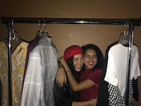
Outtakes


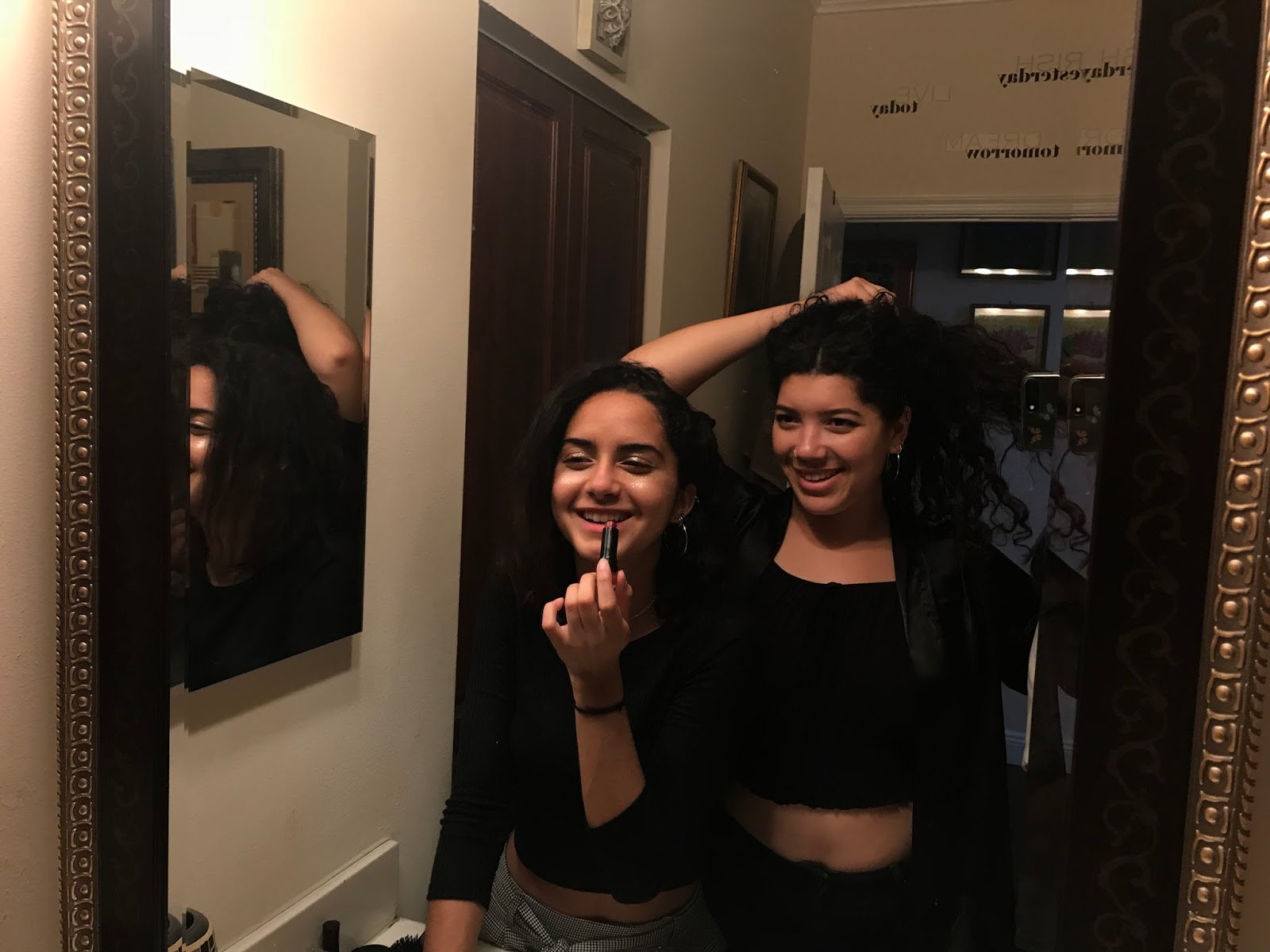
The shot of Isabelle acts as an alternative cover that I shot just for fun, but I was thinking of using it as a back cover so I could highlight both of the "models." The shot from the clothing rack shows the composition that I used for the actual photo (I will post once I edit), but shows them having a little more fun. There, you can see how the lighting isn't perfect and the photo looks a bit washed out. In the last photo, I shot it with the selfie camera with the phone against the mirror, because I was trying to get the shot from the angle pictured, but when I was behind them, the bathroom lamp completely washed them out. I thought this angle would work better than it actually did, but it came out kind of bland and ordinary.
I tried to use colored lighting for both the bathroom and clothing rack shots, but since I was alone and wasn't able to find help, I couldn't make it possible. I'm not entirely devastated because there's nothing a little photoshop can't fix, but I wish I could've shot it raw so it wouldn't lose quality, and I'd have less work to do.
Sunday, April 1, 2018
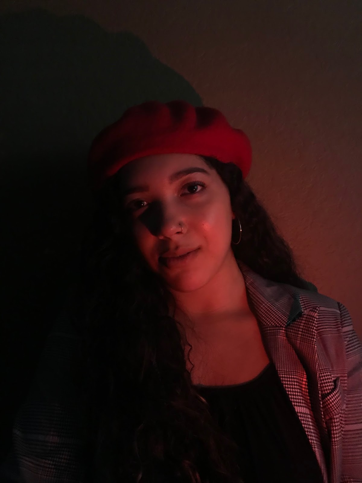
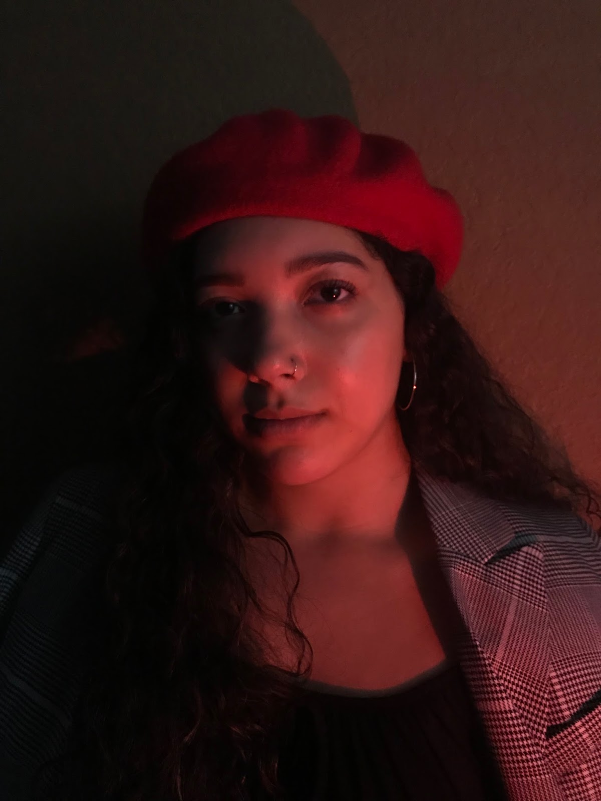
Details


This is a detail shot of Ambar's makeup with its reaction to the light, and a possible cover shot. I have a few portraits that came out better than this one, but this is the general idea for the cover. I made sure there was enough room above her head for the title, and a lot of negative space along the sides of her body to add more text. The blue came out kind of green-ish in some shots, so I had to take the exposure almost all the way down (image on the left) for it to come out as opaque as I wanted it. The shadows play very well with Ambar's figure and the natural contours of her face, which makes her "power" truly jump out of the photo.
Subscribe to:
Posts (Atom)